Practical Checklist for Turning Brand Guidelines into Cohesive Branding

How to Put Your Brand Guide Into Action: A Designer’s Checklist
Creating a brand guide is one thing — using it well is another. In my last post, The Perfect Brand Guide: A Single-Page Overview & Detailed Guide, I showed how a clear, visual guide can make brand standards easy to follow.
But here’s the next step: how do you actually apply that guide across real projects?
To answer that, I pulled together a simple usage checklist, inspired by the Triple Z Bath & Body brand guide. Whether you’re a designer, marketer, or business owner, this list will help you move from guidelines to consistent, professional results.

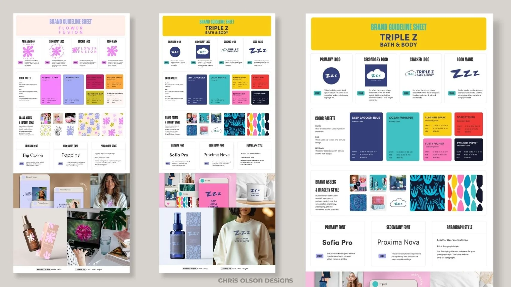
Brand guideline sheet excerpt for a beauty brand showing primary, secondary, stacked, and logo mark variations with usage notes, alongside the color palette including Deep Lagoon Blue, Ocean Whisper, Sunshine Spark, Scarlet Rush, Flirty Fuchsia, and Twilight Velvet with CMYK, RGB, and HEX values.
1. Logo Variations & Submarks
Your logo is the foundation of brand recognition.
✅ Match the right version to the right context. Think of each logo variation as having a role: the primary logo is your go-to, the secondary works when space or layout calls for it, the stacked version handles tighter designs, and submarks are perfect for small-scale details.
✅ Preserve spacing and proportions as shown in the guide.
🚫 Never distort, recolor, or drop logos onto clashing backgrounds.
2. Color Palette
Consistency in color builds trust.
✅ Use the HEX values for web and CMYK for print.
✅ Pair colors as recommended to ensure readability and accessibility.
✅ Review how the palette works together to keep your brand’s “tone of voice” clear.

Brand guideline sheet excerpt for a beauty brand showing brand assets and imagery style with packaging mockups and pattern swatches, plus typography guidelines including primary font Sofia Pro, secondary font Proxima Nova, and paragraph style specifications.
3. Patterns & Textures
Patterns aren’t just decoration — they extend your brand personality.
✅ Use approved scales and colorways only.
✅ Follow the guide’s examples for backgrounds, packaging, or accent graphics.
🚫 Don’t stretch or recolor beyond what’s provided.
4. Fonts & Typography
Typography is what makes your words look like your brand.
✅ Stick to the recommended hierarchy (ex: Sofia Pro for headings, Proxima Nova for body).
✅ Use the sample paragraph style for both digital and print to ensure cohesive messaging.
🚫 Avoid font substitutions — they dilute brand consistency.

Brand guideline sheet excerpt for a beauty brand showing product and lifestyle mockups. Applications include social media previews, tote bag, Instagram graphics, enamel mug with 'Sleep Now Worry Later,' deep sleep pillow spray with patterned packaging, and sweatshirt with Zzz logo.
5. Imagery and Asset Applications
How you use visuals ties everything together.
✅ Apply branded assets across packaging, social, and merchandise.
✅ Use the guide’s photography style as inspiration — lifestyle + product shots that feel on-brand.
✅ Keep application consistent so your audience instantly recognizes your brand.
Pro Tips for Designers
Pull assets directly from the brand guide to avoid off-brand interpretations.
Always test with real product or marketing mockups.
Update your guide regularly as new assets are created — keeping everything modular makes this process easier.
Why This Matters
A brand guide isn’t just a reference file. It’s a practical toolkit for keeping your brand consistent across every touchpoint — packaging, social media, merchandise, even email signatures.
When followed, the guide saves time, prevents confusion, and makes sure every asset feels like part of the same family. That’s how strong brands are built.
👉 Curious how your business could benefit from a single-page, easy-to-use brand guide? Get in touch here — I help brands design guides that are both strategic and practical.
The views and opinions expressed in this post are my own and do not constitute professional advice. All content is provided for informational purposes only