

Digital Makeover for a Travel Website: A Case Study
Crafting a responsive website that looks great and works smoothly across all devices.
W&H Travel is getting a digital makeover. We're zooming in on a slick, responsive website that looks great and works smoothly across all devices. Think less waiting, more exploring. It’s all about giving you a seamless experience, whether you're on a desktop dreaming up your next getaway or scrolling through your phone on the go. Our case study will walk you through the nuts and bolts of our redesign journey—how we're mixing stunning visuals with a friendly user interface to make your travel planning an adventure in itself.
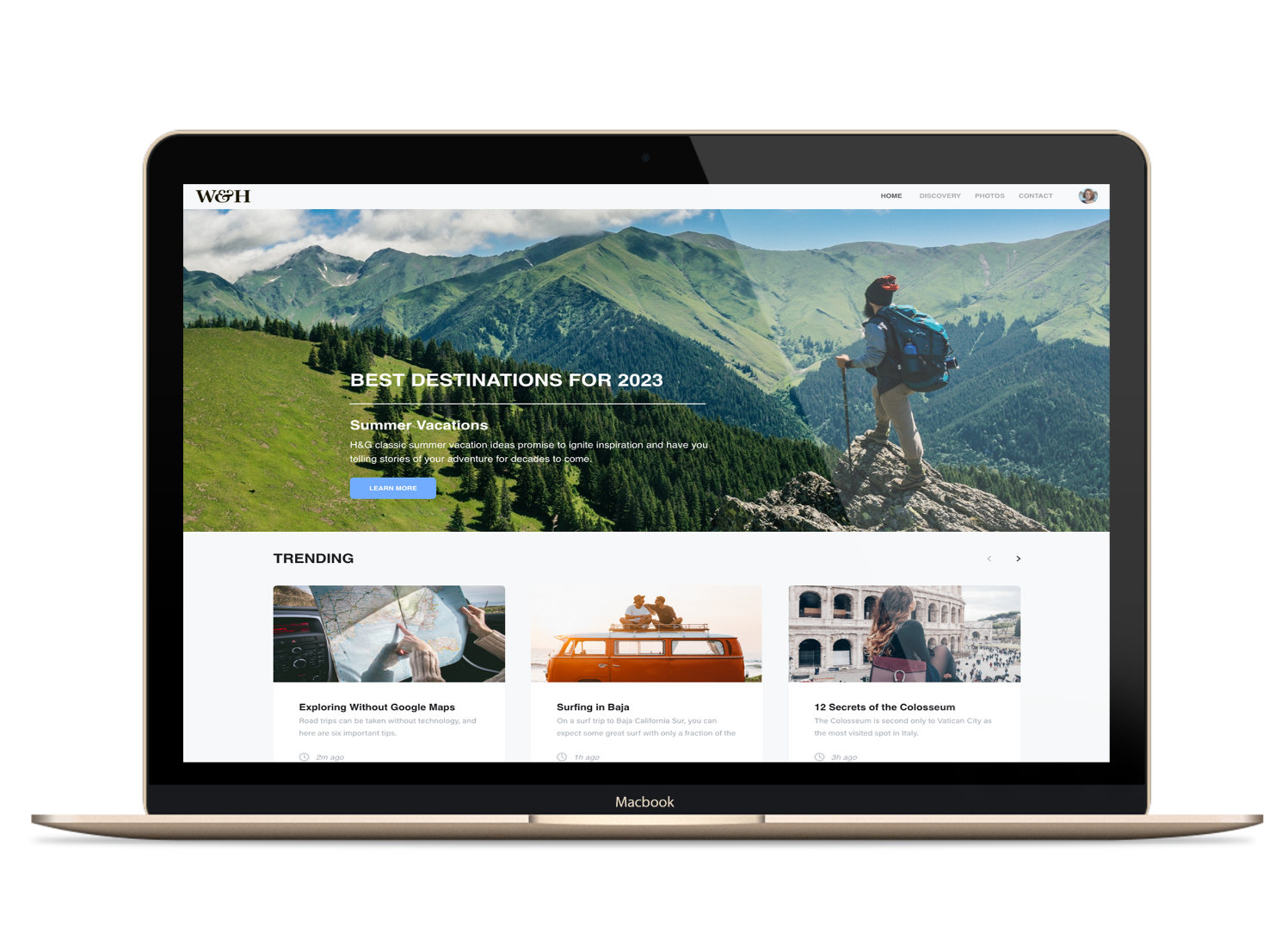
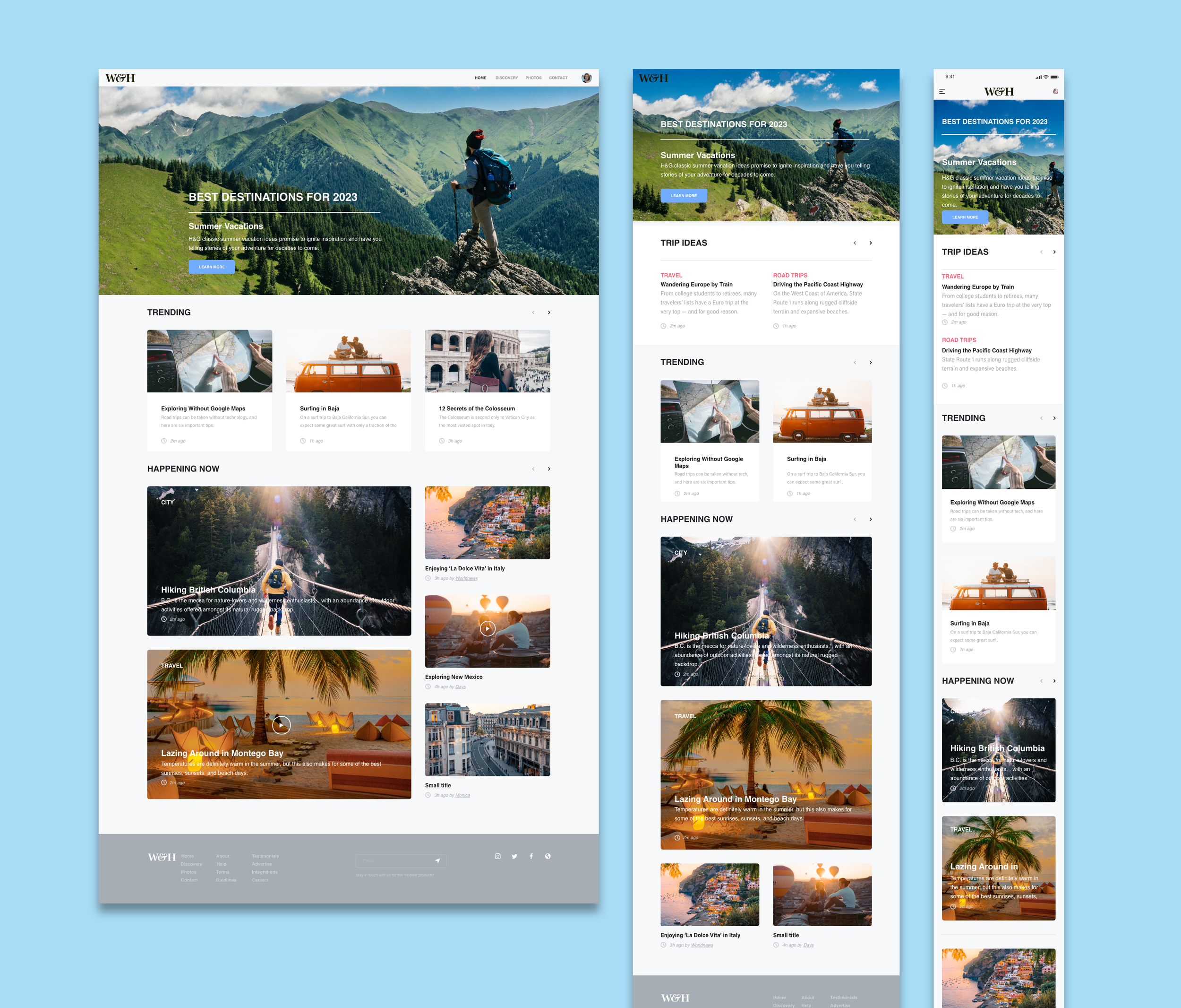
W&H Travel landing page.
Case Study and Creative Brief
W&H Travel Website Redesign
Project Overview: We wanted to give the W&H Travel site a fresh coat of paint—not just to spruce it up, but to really amp up the experience for anyone dreaming about their next getaway. Imagine flipping through a scrapbook of the best travel spots for 2024; that's the vibe we were going for. Our mission? To hook you in with stunning visuals and stories that pack a punch, making you feel the buzz of the world's wonders right from your screen.
Objective: To create a visually stunning and user-friendly travel website that highlights the best destinations for 2024, encourages exploration, and drives engagement with dynamic content.
“We wanted to give the W&H Travel site a fresh coat of paint—not just to spruce it up, but to really amp up the experience for anyone dreaming about their next getaway. Imagine flipping through a scrapbook of the best travel spots for 2024.”
Target Audience: The primary audience includes adventure seekers, cultural explorers, and vacation planners aged 25-45, who are tech-savvy, appreciate aesthetics, and are looking for unique travel experiences.

W&H Travel mood board
Tone & Style: The website should embody a modern, clean, and minimalist design ethos with an emphasis on breathtaking imagery and seamless navigation. The tone should be inviting, informative, and inspirational.
Key Visual Elements:
A striking hero image showcasing a must-visit destination for 2024.
Trending destinations with high-quality images that capture the essence of each location.
‘Happening Now’ section with vibrant, action-oriented photos.
Consistent use of a modern, sans-serif typeface for readability.
Content Strategy:
Headlines should be succinct and evocative to instantly grab attention.
Brief, engaging descriptions that entice readers to explore further.
Social proof elements like testimonials and user-generated content.
Real-time content updates to keep the ‘Trending’ and ‘Happening Now’ sections fresh.
Functional Requirements:
Responsive design for optimal experience across devices.
Intuitive navigation with a clear hierarchy of information.
Fast load times and SEO optimization to enhance visibility and user engagement.

W&H website elements.
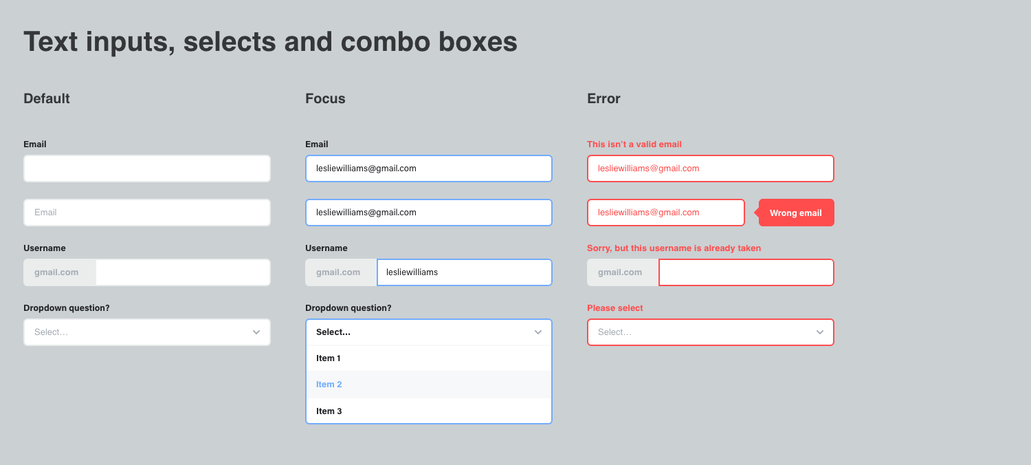
W&H website text inputs, selects and combo boxes
Deliverables:
A homepage layout that includes sections for trending destinations, current happenings, and featured articles.
Design mockups for key website pages, including destination guides and contact forms.
Style guide documentation for visual and editorial standards.